...though it's a nice weather day, but bad things happens, and also bad pictures are taken...

Sunday, April 22, 2007

Hey, Ladies...!


A few months ago, my interest in details started to increase. It gave me a chance to 'touch' life. Okay, that's an absurd sentence.

Anyway, it made me love to shot the details. Also, use macro a lot often. Nope... I don't have a macro lens. I was only using my 18-55mm lens. And it's macro enough for me.

Waiting for sunset, on a sunny afternoon, I wandered around a corn field and tried to look for details. By accident, these two ladybirds caught my eyes. They came out from somewhere, and climbed on the stem? I don't know what they were doing.

A really great composition, I must say. I love the colours and the composition. Yet, I'm ready to hear what my very-supporting-friend's opinion.

There are some blown highlights in the stem and on the ladybirds backs. He told me to try backing off the exposure. Yes...yes...exposure! Playing with it can be really helpful to improve the quality of the picture.

Still, the sunset was beautiful. Really, it was. See...the sunset even got to those ladies in the mood too...

Wednesday, April 18, 2007

Under the Coconut Tree


A warm, bright afternoon took me to the hills at the south of my city, one day. It was an hour trip, with beautiful views along the way. Then I saw this small hut under a coconut tree. It was so tropical!

So, I went right down to the corn field, and tried to frame the hut with the tree. There wasn't a lot of space to move around, and shoot in many angles. At least, I managed to take a simple, blue-and-green shot. Nice one, I said to myself. Though the smaller tree was quite disturbing.

"Lovely." I showed it to a friend. "But you could also point the camera slightly to the left, moving the tall coconut tree to the right third of the picture. Now the small tree becomes part of the picture as well. You might lose the small hut, which is charming, but it may be worth it."

Nope, I don't want to lose the small hut.

I went to my other friend.

"I think you can widen the framing a bit and strengthen the photo," he said. "You currently have a strong vertical central element that is dividing the space in half - left and right. The composition is fairly weak as such. Fortunately, the hut and smaller tree balance each other, but I'd try finding a different POV or framing without so much symmetry."

I wish I had brought a chainsaw that day, so I could cut down the smaller tree...

Sunday, January 14, 2007

Where Are the Carrots?


I know that local markets are colourful. They have so many vivid colours. That's why - though, I hate to go to local markets - oneday, I forced myself to go there. Just to take some shots.

Vegetables, fruits, meats, they were everywhere. While browsing, I saw these orange, fresh carrots in some traditional baskets. With the afternoon sunlight shone on its side. So, no more to say.

I took a few shots of the carrots. And the best of them was really good. At least for me, not for some friends of mine.

"Over-exposed!"

Yes, the pic does look a little overexposed - the foreground carrots are very bright on the right side as are the carrots in the upper right.
"Different white-balance, perhaps?"

I could maybe have stopped down a little on the fstop or increased my shutter speed a little. It's unevenly lit, being darker on the left and brighter on the right - probably the store lighting. And maybe used a different white balance.
Oh, well...

Exposure time: 1/25"
F Number: F4
ISO: 200
Focal Length: 28mm

Friday, January 05, 2007

Piece of Cake...!


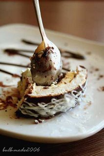
Taking shots of a whole cake is common. A nice and decent piece of cake for a subject is also common. In fact, for an amateur like I am - where taking nice pictures requires nice object - pics like those are usual. I've taken those pics several times.

But, few days ago, when I was having lunch with a friend, there was this brutal piece of cake that caught my eye - actually, it was my cake. I took my camera and tried to take some pictures of the messy piece of cake that looked delicious.

It was a nice pic (in my honest opinion)...but I guess not everyone have the same taste as I have.

"The pic was clear and well exposed," a friend said to me. "But it should have more focus on the cake."

Okay...then...?

"Looks tasty," other friend told me. "But I'm not sure if it is soft or out of focus. Try to use a smaller aperture."

Hm... It's soft. At least, I'd rather call it soft... I'll try to use a smaller aperture and see what happen, next time.

Saturday, September 16, 2006

Piano at the Temple


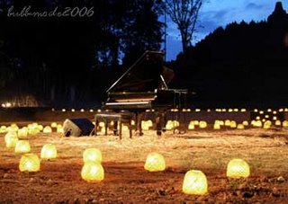
Since I learned taking pictures, I'd been waiting to have the chance visiting Borobudur temple at night. At sunrise or sunset, actually. But at night also.

Then this invitation came. A film-maker was going to make a music video at Borobudur temple! Well, I wouldn't miss that. So, when the day came, I packed my camera and head off to the temple. What I really forgot was it's going to be a night photography. And, I left my tripod at my house. Another great thing was, flash light was not allowed at the venue. Excellent!!

So I took the shots relying on my knees. I had to crouch and put my arm on my knee so the camera won't shake badly. I wasn't hoping to get any great picture, but at least it could reduce the blur.

I'm quite pleased with the result, though - for a non-tripod shot. Anyway, a friend has two comments for this pic.

The piano is a bit lost in the background.

Yes, it is.

And the piano being slap-bang in the middle is quite disturbing, for him.

Yes, it.... what?! Is it?

...well, okay...a knee is good for reducing shakes, but to have a tripod would be better for the composition...

Saturday, August 19, 2006

Nice Day to Be Out of Office


It was a sunny afternoon! But instead of traveling around, shooting some pics, I was trapped in this building, doing an unbelievably boring task... it's called waiting! Thank God, I had my camera right beside me...

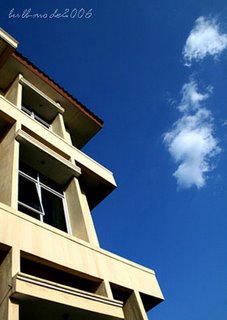
Having only a building as a subject and the whole boring furnitures inside it, I tried to compose a nice shot. The blue sky outside the building was fascinating. So I went out, regardless the waiting task, and had a few shots.

The outcome was great. At least from my point of view. But from my experiences before, I knew I had to have a second opinion.

First comment, "The colours are lovely!"
Second comment, "But the converging lines are too strong."
My comment, "......"


Yes, I see it now. The left edge of the photo and the lines of the building. Converging lines can add some value to my composition, but this one just ruins it. Huh... I guess I shouldn't use a wide-angle lens. Better remember this in the next shot!

Monday, August 14, 2006

Blue, Blue, Blue Volcano


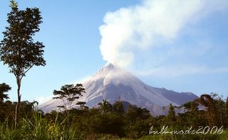
A volcano, 30 km from my place... lately, this volcano has caused a lot of fear among us. It's still active and ready to errupt anytime... at that time, of course.

After trying to take some pics of it for a few times, and blew it all...finally I found a great place to take pics of the volcano. Five o'clock in the afternoon, the sun was still shining, golden hours...! And the sky was blue - my favorite colour for a sky!

I tried to make a nice composition, with the trees, the volcano, and the sky. It really reminds me of pictures that I usually paint when I was a child.

But the result got me down a little... the colour was a little flat. The sky wasn't as blue as I hoped. Other than that, it's a nice pic!

Yes, I could repair the colour using Photo Shop... but using a polarizer when shooting would be a good help, too. I should think of getting one of them soon...hmpfh...

Thursday, August 10, 2006

One... two... and... Click!


My 2 yo little cousin, adorable. He was going to go shopping with his parents, but I managed to get him posed for me. Luckly he was in a good mood, so making him post was not a trouble at all. Good mood and a bright afternoon, just perfect!

...but it seems to be a bit too bright...

The over exposed background, hat and hands over his head is quite disturbing. Yet, what else could I do?

Suggestion from a friend: Next time, take him under a shade, and let the natural light falls on his face!

Yeah, sure... why didn't I think of that?

Wednesday, August 09, 2006

Framed by the Reefs!


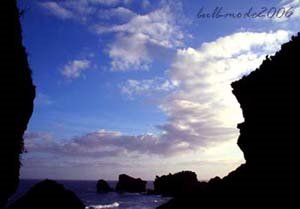
It's not so early in the morning. I showed my friend a picure that I took on my last trip to a beach, 2.5 hours far from my place. It was a nice day for taking picture... but I think it was too late to have this one. I was expecting to get a decent pic... and a few compliments from my friends.

Me: I think it's a nice pic...
Friend: Yes, quite nice...
Me: Aha!
Friend: The reefs kinda framed the pic, the sky was so blue, and the clouds... nice one!
Me: Yup! (smiling proudly)
Friend: But, I'm missing something here...
Me: What?! (focusing on the monitor, really focusing)
Friend: Look, what's your focus? I mean, if you're focusing on the sky, then it would be better to have a reddish sky, than a bluish one. And the reefs...
Me: ...too dark, huh?
Friend: Indeed. Well, you should buy a flash. It really comes in handy for shooting pictures with low light like this one...
Me: I think my built-in flash can do good too... (feeling down)

Thank you! I turned off the computer.

Monday, August 07, 2006

Bewildered


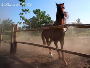
I took this pic about a month ago. In a nice sunny afternoon. The golden light shone perfectly, and the horse was also in a good mood for running around. This could have been a great pic. With all the dust scattered around, and the horse went wild.

But?

The face of the horse was just too dark, in only one side. No details of it could be seen. To push the brightnes using PhotoShop will ruin the pic completely. Some suggested - next time when I decide to retake the pic - to use a fill-in flash to get the details of the face by not ruining the landscape. I guess I need to try this fill-in flash trick.

The bamboo fence also distracted the focus a little. But in my opinion, moving forward and put the fence out of the frame would give a worse composition, and not to forget, a greater chance to be run over by the horse!